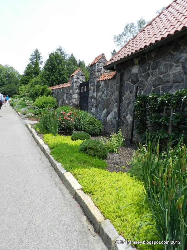
My recent visit to Biltmore showed me many great landscape and garden design tricks. I thought I'd share some examples of the principles of landscape and garden design with you all today in the form of pictures of the wonderful Biltmore Gardens. Let's begin shall we?
1. Use groundcover plants or low growing plants at the front of the border for interest. When looking at a garden it is best to tier the plants with the tallest in the back descending to low growers in the front. Low growers have the added benefit of being able to soften the lines of the garden and prevent weed growth if planted thickly.
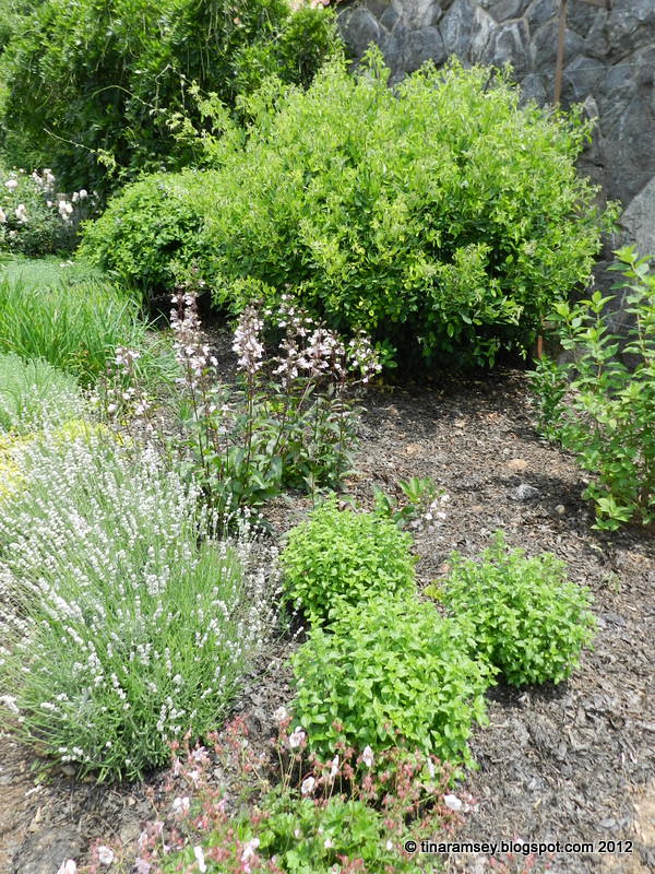
2. Mix shrubs with perennials. This is known as a mixed border. Using shrubs ensures there is something interesting to look at all year.
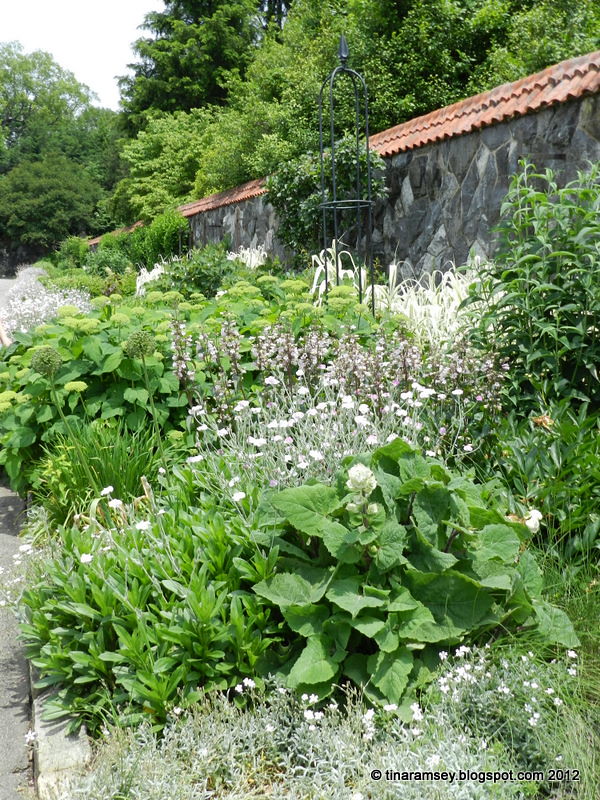
3. Use different bloom and leaf forms for contrast.
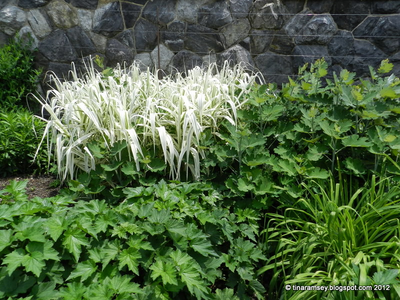
4. Use different colors for that wow factor. Do you notice how the white plant appears even more white when surrounded by dark plants? I suspect the dark plant (anemones) are probably white. When they bloom I bet they are going to be white which will work pretty well with the white grass.

5. Use different forms of plant growth such as vertical (the iris), mounding (lamb's ears), groundcover (sedum), cascading (miscanthus), and so on. Other growth forms include: vase shaped, roundy, frilly, upright, trailing, etc.

6. Use architectural plants such as the yuccas shown above. Architectural plants remain a major presence year round and are usually quite substantial.
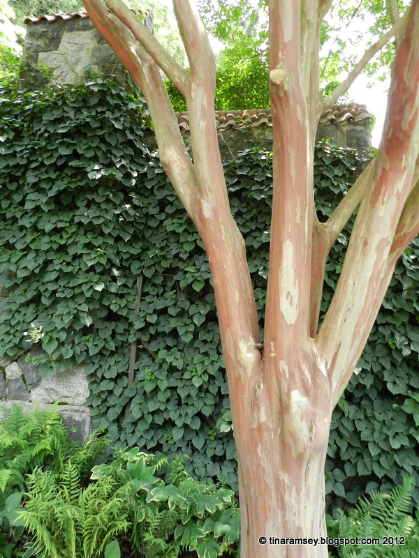
7. Layer your plants by using trees, shrubs, vines, perennials, annuals, and bulbs. Here we see the attractive bark of a crepe myrtle with a climbing hydrangea in the back on the wall, at the foot of the vine grow ferns and Solomon's seal.
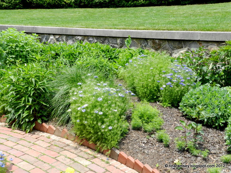
8. Have neat edgings and paths easily traversed.
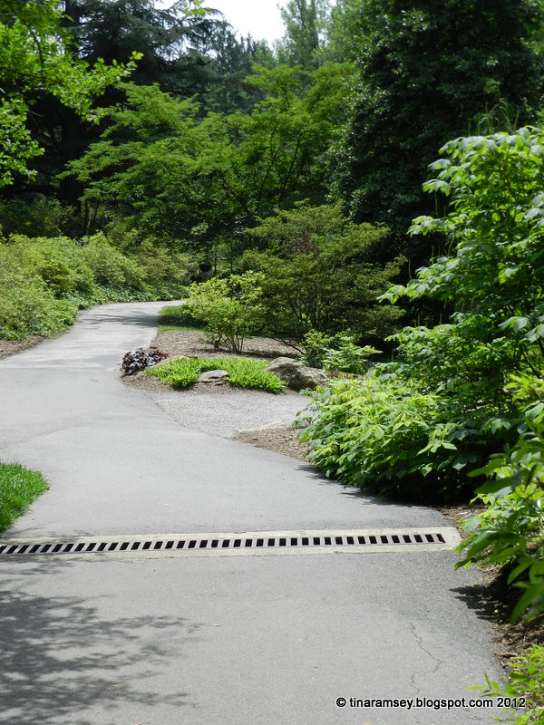
9. Design paths where the destination is a secret. The fun is in the journey.

10. Use focal points to draw the eye. Where does eye go to immediately when looking at the above picture?

11. Don't forget age in a garden. We can clearly see the age in the above tree and nothing makes you feel more at home than well worn and loved things such as this gnarled and giant tree trunk. It looks like a good spot to lay down for a nap huh?
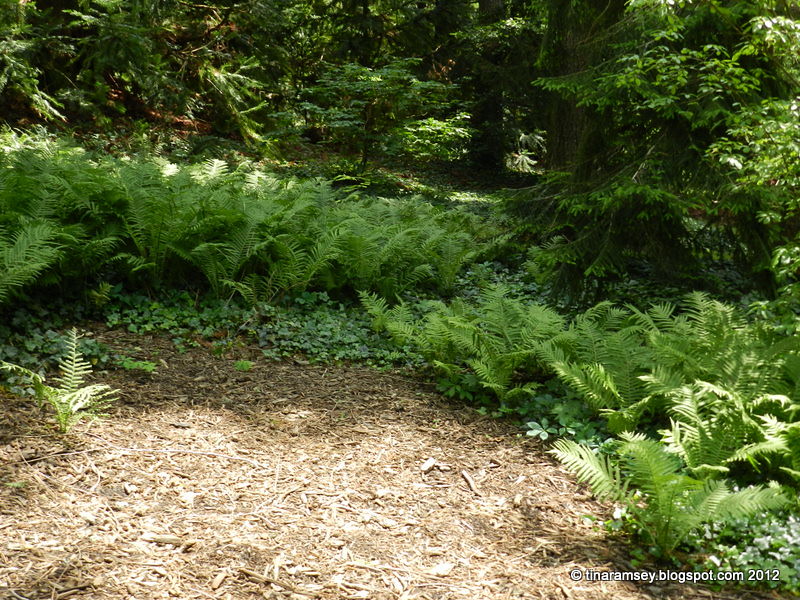
12. Be sure to include shade in your landscape. No matter how pretty sunny gardens are people always appreciate shade.
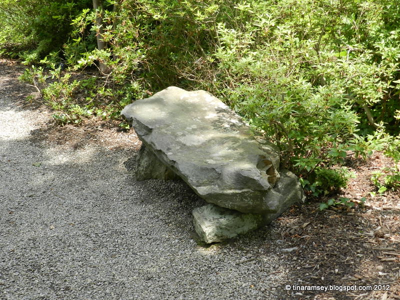
13. Be sure to leave a place to sit and use hardscaping to complement the gardens.
For more landscaping ideas for your backyard check out Reader's Digest backyard ideas....
in the garden....
Words and Photos Property of In the Garden Blog Team, In the Garden
This is exactly why I hesitate to join gardening tours...it makes me want to rip out and start over! I just love the first few photos of the borders and visuals of the layering.....
ReplyDeleteGreat post with wonderful visuals.
ReplyDeleteThank you for providing these hints and showing us examples.
ReplyDeleteWonderful advice and illustration, Tina. You laid it out in easy to understand fashion. The gardens at Biltmore had many ideas and design tips to incorporate in home gardens and landscapes.
ReplyDeleteGood advice. Improving our paths has been our project this year and we still have a bit more to do when the budget heals up!
ReplyDeleteIt may have been a Southern Living article over 20 years ago where I first heard about using a mix of "frilly, spiky, round" leaf plants together.
Great post Tina. Very informative. So pretty & well worth the visit. It's been a long time since I've seen it.
ReplyDeleteGreat advice, Tina. This was such a beautiful garden that I got caught up in the overall effect rather than noticing the details that you pointed out.
ReplyDeleteYou saw way more then me in this garden. The Saint and I spent more time visiting with bloggers and less time touring this garden and the surrounding paths. I even missed the Gift Shop! We must get back up there some time so we can tour this garden properly and see it all.... I love that picture of the Tree Trunk framed by all the lush green! Great eye girl...
ReplyDeleteThe crepe myrtle trunk and the trunk of the old tree are just stunningly beautiful.
ReplyDeleteGood points Tina! That one picture looks like the Clary Sage has an open bloom! Good one.
ReplyDeleteThe garden looks so tranquil!!
ReplyDeleteThx for sharing more pics of those wonderful gardens I missed...great pointers for us to remember...
ReplyDeleteGreat post. I am going to keep in mind the texture and mixing it all up part in particular, since it is most relevant for me.
ReplyDeletehttp://www.flowersforums.com/ruth/blog/
Tina, I love that you used the Biltmore to write about good design principles! What an excellent idea!
ReplyDelete